
Colour Mixing
Colour Mixing
Colour matching is a skill that develops over time with practice, so be patient with yourself. There are countless colours and brands available, which can feel overwhelming at first. If you’re a beginner, it’s wise to start with a more affordable brand such as Winsor & Newton. Higher end brands like Michael Harding can be quite expensive, particularly in Ireland.
Begin with a basic selection of colours rather than buying every variation available especially greens. Mixing your own greens will significantly improve your understanding of colour and give you greater flexibility. In fact, a limited palette is often more effective than a large set, as it encourages learning through experimentation and leads to a deeper understanding of colour relationships.
Suggested Starter Palette (Budget-Friendly)
Whites: Titanium White
(Historically, artists used lead white, but it is now restricted or banned in many countries. For example, Ireland and Germany only permit its use for art restoration and historic preservation.)Reds: Cadmium Red, Alizarin Crimson
Yellows: Cadmium Yellow, Yellow Ochre
Blues: Ultramarine Blue, Cerulean Blue or Phthalo Blue
Earth tones: Burnt Umber, Burnt Sienna
Blacks: Ivory Black
Keep in mind that oil paints vary between brands in pigment strength and consistency. This is something you’ll become familiar with through experience.
As you progress, you may expand your palette with pigments such as Cobalt Teal or Quinacridone Rose. These are strong, highly saturated colours and should be used sparingly, as they can easily overpower a mix. It’s best to master the basics before investing in more expensive paints.
Understanding Pigment Properties
(Paint tubes usually include this information.)
Transparent paints: Ideal for glazing techniques, where thin layers build depth.
Opaque paints: Provide strong coverage and a flatter, matte appearance great for impasto (thick application).
Semi-transparent / semi-opaque: Offer partial coverage.
Mix using a palette knife instead of a brush. It will keep your colours clean and vibrant. Fold the paints back and forth to avoid streaks. Mix value before adapting to changing it to dark or light shade. Add small amounts at a time as some pigments are strong and will overpower your mix. Avoid using white and black if possible as these can take away the colour intensity or chroma. You can lighten red with yellow or oranges with naples yellow for warmth. For a black alternative use a brown, blue and red. Another example for you to darken red, add green(complimentary colours on opposite side of the colour wheel, they neutralize each other,creating a natural shadow).
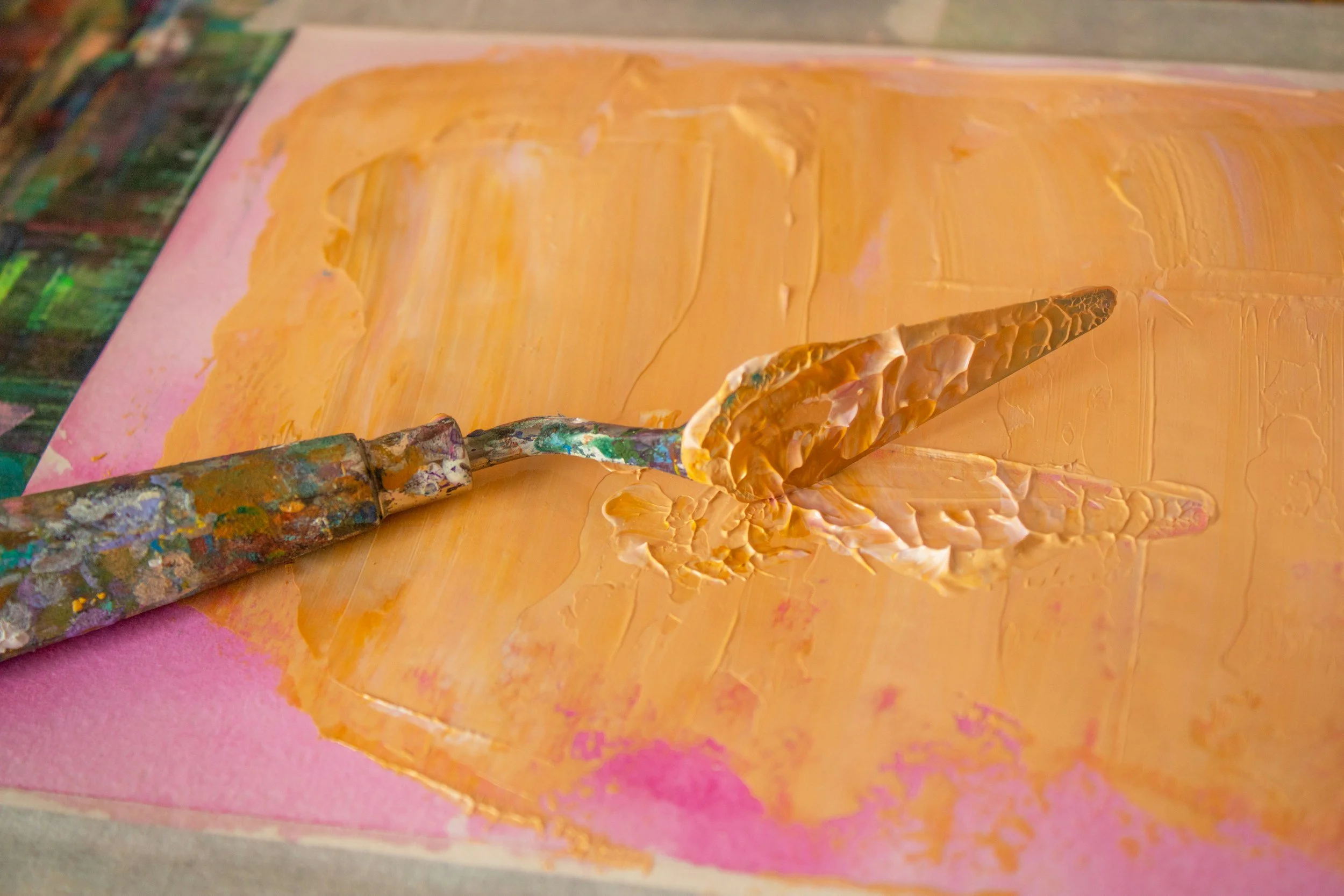
Palette Knife Mixing
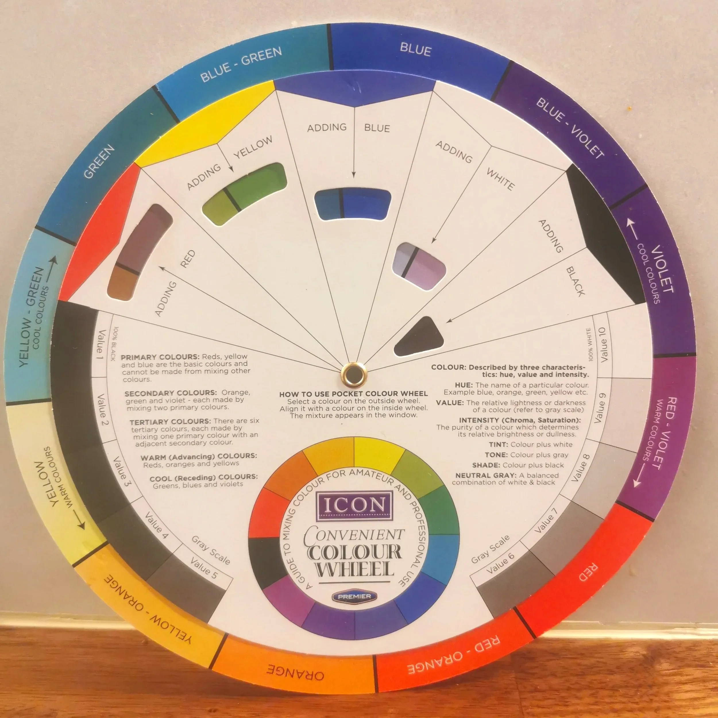
ICON Colour Wheel
Maintaining a consistent palette layout can greatly improve your mixing process. It reduces confusion and helps build a reliable system for achieving colour harmony.
A helpful habit is to keep a colour mixing journal. Record successful mixes with notes and visual references this becomes a valuable resource over time.
Another useful technique is to laminate your reference photo. Mix your colours on the palette with a palette knife, then compare them directly against the laminated image. Many artists find this easier than working from a digital screen.
HAPPY MIXING!!!